Colours, colours, colours… Is there anything more powerful in interior design? The way a room feels and even functions can be defined by the colours we choose to dress it in. Every shade you introduce to your place has the power to transform the mood or bring harmony.
A small room suddenly feels larger, and a plain corner becomes a cosy retreat. Sometimes, all it takes is the right palette.
But it all depends on colour theory. Knowing how to mix and match different hues so they work together for the best effect is not always easy, and it can sound a bit complicated. But don’t worry—this guide will break it down into simple, beginner-friendly tips you can keep applying right this instant.
The Colour Wheel Explained Simply
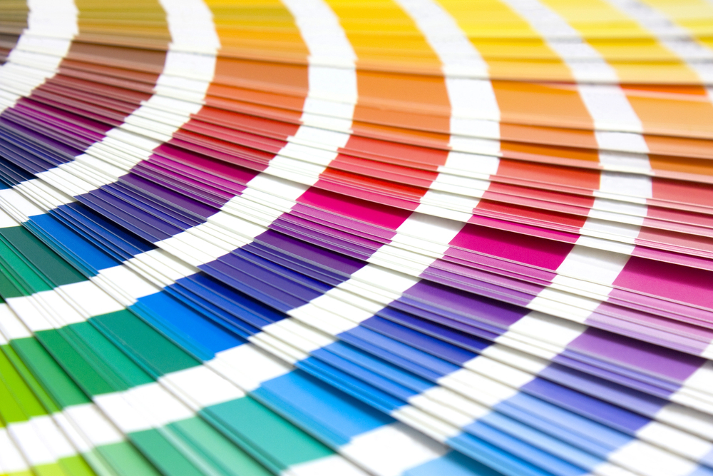
It is a notion that’s been around since 1666, when Sir Isaac Newton developed it for the first time. Since then, everyone who’s ever had to deal with colours professionally has studied and relied on this diagram or its variations. Regardless of which version you’re looking at, the colour wheel’s main goal is to organise colours and reveal their relationship to each other through primary, secondary, and tertiary colours.
Why is it important? It shows how colours interact to create balanced schemes and helps you identify harmonious, analogous, and complementary combinations.
But let’s look at the three main categories:
Primary Colours: Red, Yellow & Blue
Primary colours are three pigment colours, red, yellow, and blue, which you cannot form by any combination of any other colour. Every colour you can ever think of can be derived from a combination of these three hues.
Secondary Colours: Green, Orange & Purple
These are the colours you get by mixing the primary colours. Here’s how:
Yellow + Blue = Green
Red + Yellow = Orange
Red + Blue = Purple
Tertiary Colours: Yellow-Orange, Red-Orange, Red-Purple, Blue-Purple, Blue-Green & Yellow-Green
These are the hues that you get by mixing a primary and a secondary colour.
You may ask how this is useful. Well, designers use the wheel to select palettes that evoke specific moods and feelings, such as warm, cosy spaces with reds and oranges or calm, serene ones with blues and greens.
How Designers Use the Wheel to Create Harmony
Harmony, particularly colour harmony, is about engaging the viewer by creating an inner sense of order, balance and visual experience. If something is not harmonious, it’s boring or chaotic. So, when we play with colours, our job is to build harmony through logical structure.
Observe the wheel for one of these colour relationships to help you achieve harmony in your interior design:
- Complementary colours: These are the ones that stay opposite each other on the wheel – like blue and orange – and can be used to create striking contrasts. A statement wall? Accent cushions? Don’t mind if we do.
- Analogous colours: These are the neighbours of the wheel, e.g. yellow, green, and blue. Use these in combinations for natural harmony, like building a soothing atmosphere in your bathroom and bedroom.
- Triadic colours: These are three evenly spaced hues like red, yellow, and blue. These can be used to balance variety with cohesion. Imagine a living room with soft blue walls as the dominant colour, a mustard-yellow sofa to add warmth, and small pops of red introduced through cushions, artwork, or a rug. The key is to let one colour take the lead while the other two act as accents, ensuring the space feels vibrant and cohesive rather than overwhelming.
And now that we have some of the basics, let’s turn our attention to how we can implement what we learned into our homes.
Lay the Foundations: Start With a Good Base
Every good interior scheme starts with a good base colour. Usually, the best choice is to go for a timeless and neutral foundation like beige, grey, white, or similar shades. Of course, you can also play it bold and go for a shade that you’re drawn to personally.
From then on, a simple way to keep the palette balanced is to follow the 60-30-10 rule: Let the base cover around 60% of the room, for example, floors, walls, and large furniture, add the secondary shade for 30% of the space, and finish with 10% in a bold accent. Wall art is a fantastic way to introduce that accent colour, be it through a vibrant abstract print or a subtle piece that ties it all together.
Pops of Colour: Less Is More
The reason your base colour is a neutral is that shades like white, beige, and grey provide balance and help to ground bolder colours and prevent a space from becoming overwhelming. They are your canvas that gives you the freedom to play with any other more adventurous hue. Add a splash of personality and colour against your neutral backdrop and instantly, you’ll draw the eye!
Colour Contrast: The Secret to Depth and Drama
Use high-contrast colour pairings to create a dramatic and modern feel (e.g., a white wall, dark furniture). Use low-contrast palettes like creams layered with taupe to bring out that subtle, elegant harmony and calm.
But you don’t have to stop there. You can also mix light and dark shades within the same room to add depth and prevent the space from feeling flat.
Tying it All Together
Once you get the gist of how the colour wheel works, how to build harmony and balance contrast, nothing stops you from building your perfect space that doesn’t just strike with beauty but also feels just right.
Just remember: a base will set the tone, the accents will add character, and the contrast will ensure there’s just enough depth for perfect balance.
And whatever you do, experiment with what you’ve learnt. Colour is meant to be played with, whether in wall art, textiles, or small decor pieces. Start small, use your instincts, and soon, you’ll be transforming with confidence and style!