Choosing the right colour scheme for your bedroom walls can significantly impact your mood, sleep quality, and overall ambiance. Whether you prefer a tranquil retreat, a vibrant space, or a sophisticated aesthetic, selecting the perfect hues requires careful consideration of multiple factors. In this guide, we’ll walk you through the essential elements to consider when choosing a bedroom colour scheme.
1. Understand the Psychology of Colours
Colours evoke emotions and can influence your overall well-being. Here’s a quick breakdown of how different colours affect the bedroom’s atmosphere:
- Blue – Calming and soothing; ideal for relaxation and sleep.
- Green – Refreshing and harmonious; promotes a peaceful environment.
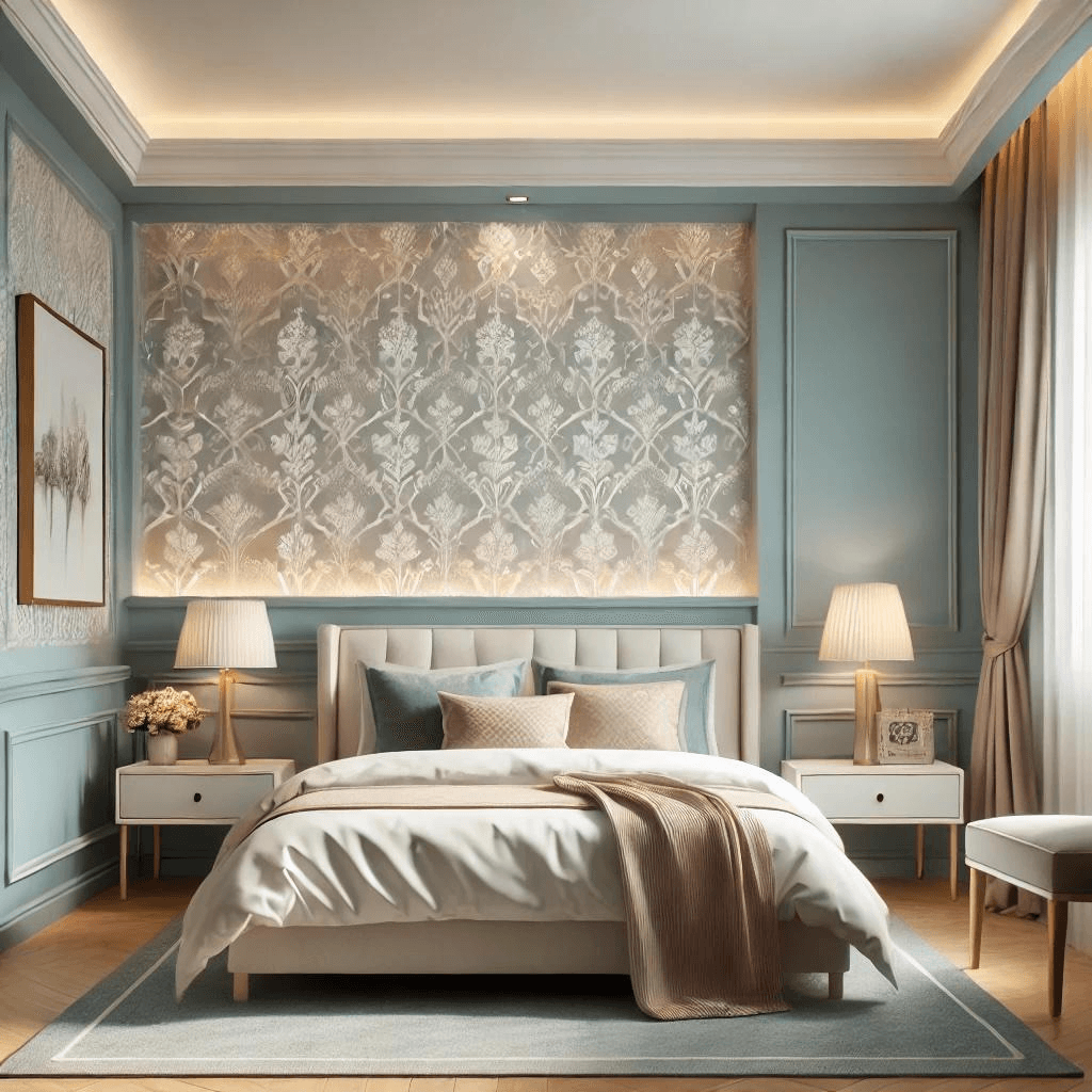
- Neutral tones (Beige, Gray, White) – Versatile and timeless; create a serene and sophisticated look.
- Pastels (Lavender, Soft Pink, Light Yellow) – Gentle and inviting; enhance a cozy and warm feel.
- Dark shades (Navy, Deep Green, Charcoal) – Elegant and intimate; perfect for a luxurious bedroom vibe.
2. Consider Your Room’s Natural Lighting
Lighting plays a crucial role in how colours appear. Rooms with ample natural light can handle darker shades without feeling too enclosed, whereas dimly lit rooms benefit from lighter tones to make them appear more spacious and airy.
- North-facing rooms: Tend to receive cool, indirect light throughout the day, which can make colours appear darker and more muted. To counteract this, use warm tones like soft peach, cream, or honey beige to add warmth and brightness to the space. These shades help create a cozy, inviting atmosphere that prevents the room from feeling too cold.
- South-facing rooms: Benefit from consistent natural light throughout the day, allowing for flexibility in colour choices. Cooler hues like light blue, soft gray, and even muted greens work well to balance out the brightness while maintaining a relaxing ambiance. South-facing rooms can also accommodate bold shades like deep navy or emerald green without feeling overpowering.
- East-facing rooms: Receive warm, golden sunlight in the morning but become cooler in the afternoon. To maintain a balanced atmosphere, soft pinks, warm grays, and pale yellows can enhance the early daylight while preventing the room from feeling too dim later in the day. If you use your bedroom more in the evening, consider warmer neutrals to create a cozy effect.
- West-facing rooms: Are often dim in the morning but receive intense sunlight in the late afternoon and evening. This varying light means that colours can look different throughout the day. Earthy tones like terracotta, burnt orange, and warm neutrals complement the shifting light, creating a comfortable and inviting space. If the afternoon sun makes the room too warm, consider using cool blues or muted greens to balance the temperature visually.
By understanding how light interacts with colour, you can select shades that enhance your bedroom’s natural atmosphere and create a harmonious and comfortable space.
3. Match Colours to Your Bedroom Theme
Your bedroom’s style should guide your colour selection:
- Modern Minimalist: Stick to neutral palettes like white, beige, and gray.
- Bohemian Chic: Earthy tones like terracotta, olive green, and mustard yellow create a cozy look.
- Classic & Traditional: Rich tones like navy, deep green, and burgundy enhance elegance.
- Scandinavian: Soft pastels and muted grays work best for a clean, airy feel.
- Luxury & Glamorous: Deep jewel tones like emerald, sapphire, or rich purples create an op
3. Match Colours to Your Bedroom Theme
Your bedroom’s style should guide your colour selection:
- Modern Minimalist: Stick to neutral palettes like white, beige, and gray.
- Bohemian Chic: Earthy tones like terracotta, olive green, and mustard yellow create a cozy look.
- Classic & Traditional: Rich tones like navy, deep green, and burgundy enhance elegance.
- Scandinavian: Soft pastels and muted grays work best for a clean, airy feel.
- Luxury & Glamorous: Deep jewel tones like emerald, sapphire, or rich purples create an opulent ambiance. Pairing these shades with classy & elegant wallpapers can further elevate the bedroom’s aesthetic.
4. Balance Bold and Neutral Colours
If you love bold colours but don’t want them to be overwhelming, consider using them as accent walls while keeping the other walls in neutral shades. For instance:
- A deep navy or forest green accent wall combined with soft beige or off-white.
- A blush pink or muted coral wall paired with warm gray or light taupe.
- Charcoal or black paired with crisp white and gold accents for a modern look.
5. Use Colour to Enhance Room Size
The right colour palette can make a small room appear larger or a large room feel cozier:
- For small bedrooms: Light shades like soft white, pastel blue, or pale gray create an illusion of space.
- For large bedrooms: Darker shades like charcoal, navy, or deep plum add depth and warmth.
- For awkward spaces: Two-tone walls or colour-blocking techniques can visually reshape a room.
6. Choose a Finish That Complements Your Colour
Different paint finishes can affect the overall look and feel of your bedroom walls:
- Matte finish: Soft and sophisticated; best for hiding wall imperfections. It absorbs light rather than reflecting it, making it ideal for creating a cozy and intimate atmosphere. However, it may not be the best option for high-traffic areas as it can be harder to clean.
- Satin finish: Slight sheen; easy to clean, ideal for high-traffic areas. It balances durability with a smooth, elegant appearance, making it suitable for bedrooms that require frequent maintenance.
- Eggshell finish: Smooth with a slight luster; a great middle-ground choice. It offers a delicate sheen that enhances depth and character while remaining relatively easy to clean, making it a versatile option for most bedroom styles.
- Glossy finish: Reflective and bold; best for accent areas rather than entire walls. It adds a high-shine effect that makes colours pop, creating a striking visual contrast. While it is durable and easy to clean, it can highlight imperfections, so it’s best reserved for decorative elements or well-prepared surfaces.
7. Test Before You Commit
Before finalizing your colour choice, test samples on your walls. Observe how they look in different lighting conditions throughout the day. You can also try peel-and-stick wallpaper in complementary colours to see how various shades interact with your room’s decor.
8. Coordinate with Furniture and Decor
Your bedroom walls should harmonize with furniture, bedding, and accessories:
- Wood furniture: Works well with earthy tones and warm neutrals.
- Metallic accents: Pair beautifully with deep jewel tones or monochromatic palettes.
- Soft furnishings: Coordinate bedding, curtains, and rugs with wall colours for a cohesive look.
9. Stay Timeless but Personal
While trends change, your bedroom should reflect your personality. If you love a bold colour but worry about longevity, incorporate it through accents like bedding, artwork, or an accent wall rather than painting the entire room.
Conclusion
Choosing the right color scheme for your bedroom walls involves understanding color psychology, considering lighting, aligning with your decor style, and testing shades before committing. Whether you prefer calming neutrals, bold statements, or luxurious elegance, the right colors can transform your bedroom into a stylish and comfortable sanctuary. Don’t forget to experiment with different materials to add texture and personality to your space!